


 Português
 English
Setting features are often not the most visible part of product design; users only think about going to settings when they encounter a problem. At this moment, users are likely to be anxious, so the quality of the settings interface experience directly determines their perception of the product. A well-designed settings panel can help users resolve their issues with ease, while a poor experience can amplify negative impressions, especially for users already in a bad mood.
In designing settings pages for DingTalk-related products, we’ve encountered many pitfalls. Here are 7 common “pitfalls” that I’d like to share with fellow designers to help you avoid them!
Piling up too many settings options
In product design, some settings don’t actually need to be left for users to choose. However, when there’s internal disagreement within the product team, the temptation arises to add more settings as “personalization” features for users to decide. For example, options like navigation width or content compactness fall into this category. These “settings” aren’t something users would naturally think of based on first principles; they lack clear use cases and are essentially forced choices imposed by the product team.
Recommendations:
1. Streamline settings options
● Avoid piling up too many features, which can degrade the user experience;
● Regularly remove settings that are no longer used or have minimal impact;
● Group infrequently used settings under “Advanced Settings” or hide them in collapsible menus.
2. Set reasonable default values to reduce unnecessary “settings”
Provide default settings that work well for most users to minimize the need for adjustments.
Recommendations:
You can effectively organize information in the following ways:
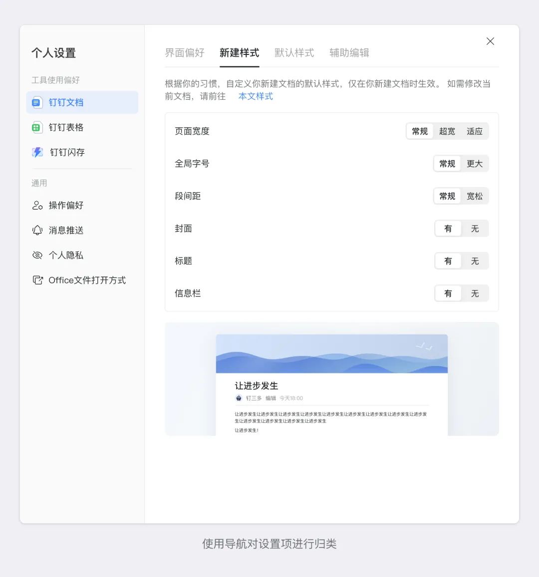
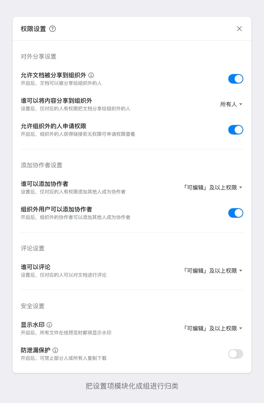
1. Logical grouping: Group settings by function or theme, such as “Account Settings,” “Notification Settings,” and “Privacy Settings.”
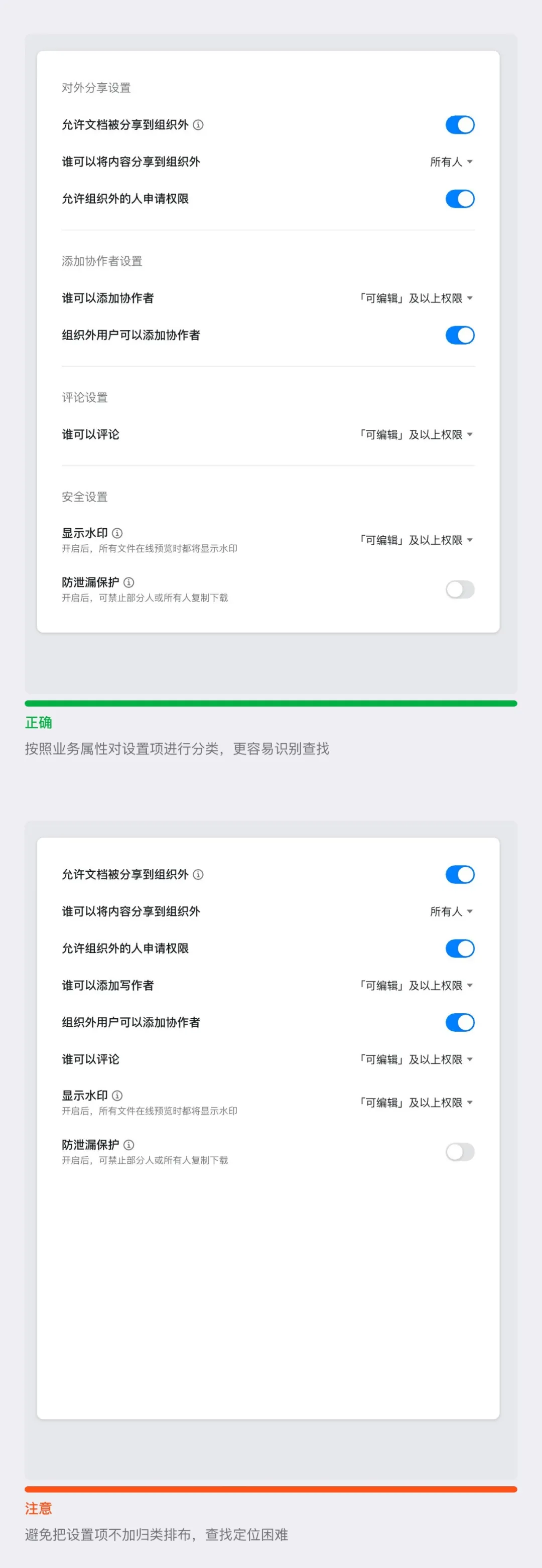
2. Clear hierarchy: Use headings, dividers, or spacing to distinguish between different groups of settings and prevent clutter.
3. Avoid excessive nesting: Deeply nested settings increase user effort; limit the hierarchy to 2–3 levels whenever possible.
Most settings pages are enriched through iterative updates. From the very beginning, it’s crucial to define clear design guidelines for the settings page. Otherwise, inconsistencies in alignment—such as toggles being left-aligned in one iteration and right-aligned in another—can lead to a chaotic information layout and a poor user experience.
Recommendations:
1. Consistent styling: Ensure that interactive elements like buttons, sliders, and input fields maintain a uniform style and size across the interface.
2. Proper alignment: Use left or right alignment to keep content neat and easy to read.
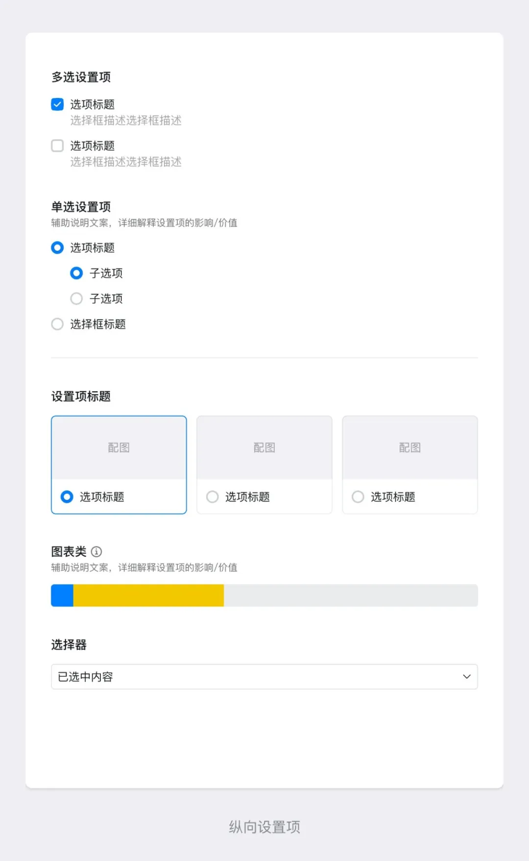
3. Define setting types and use cases: Classify settings based on layout—for example, horizontal settings, vertical settings, and full-width settings—to ensure a clean and intuitive interface.
Horizontal settings:
● When settings primarily involve toggling or selection, with an operation flow from left to right, use horizontal settings to maintain a left-right layout, with actions aligned on the left.
● For single-selection settings, consider using full-width settings.
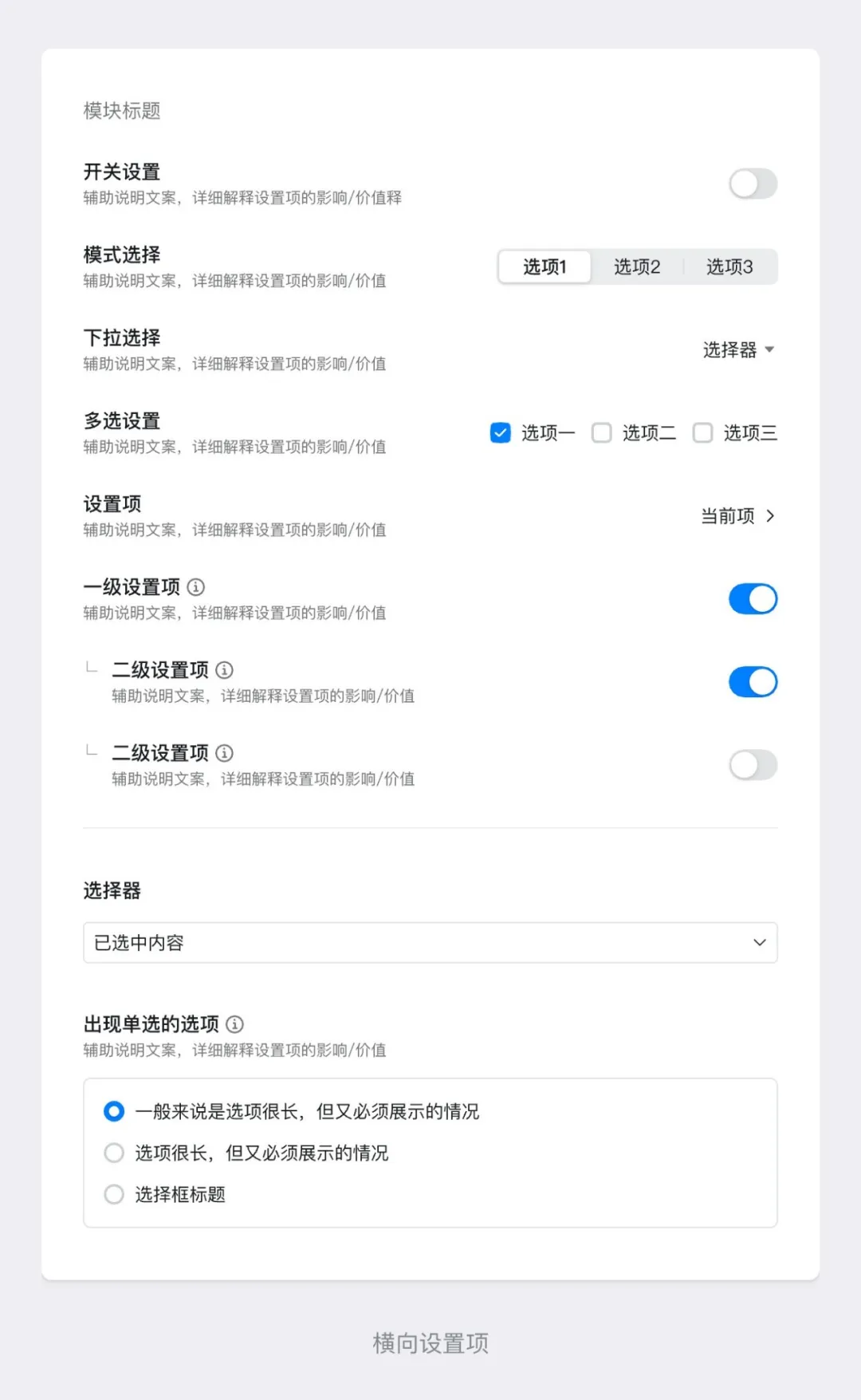
Vertical settings:
● When settings involve multiple selections or single selections, with an operation flow from top to bottom, use vertical settings to maintain a top-to-bottom layout, with actions aligned on the right.
● When certain settings cannot follow a vertical layout, consider using full-width settings as a supplement.
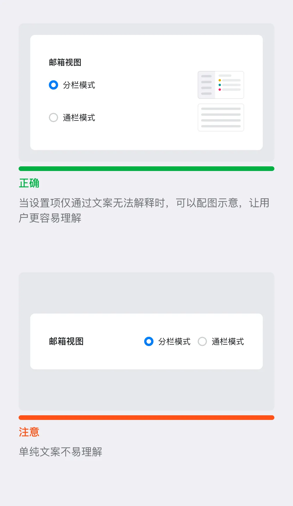
In DingTalk’s business scenarios, many use cases are difficult to describe clearly through text alone. If a setting option relies solely on text, users can’t easily understand the effect or feedback after making a change—they’re left to guess or rely on trial and error.
Recommendations:
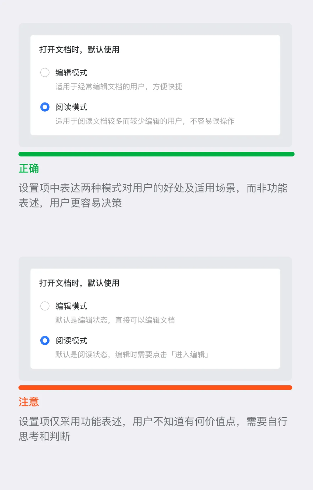
1. Use simple, understandable language: Avoid technical jargon and ensure that ordinary users can grasp the purpose of each setting.
2. Communicate user value: Move away from business- or tech-focused feature descriptions and focus on explaining the benefits users will gain.
3. Combine text with visuals: For settings that are hard to describe with text alone, use a combination of text and images to make the options more tangible for users.
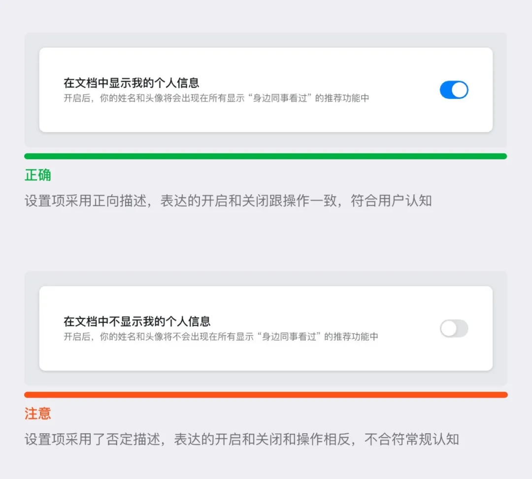
Some settings are enabled by default, but when describing these settings, the business side may frame the description in a negative way—for example, “Disable [feature X].” The switch is set to “off.” This double-negative phrasing doesn’t align with how users intuitively perceive information. When users go to the settings page, they’re looking for a way to “turn off” a feature, not to “enable” it.
Recommendation: Use positive, affirmative language for settings descriptions. Whether a feature is enabled or disabled by default, the description should focus on the outcome and value of enabling—or disabling—the feature.
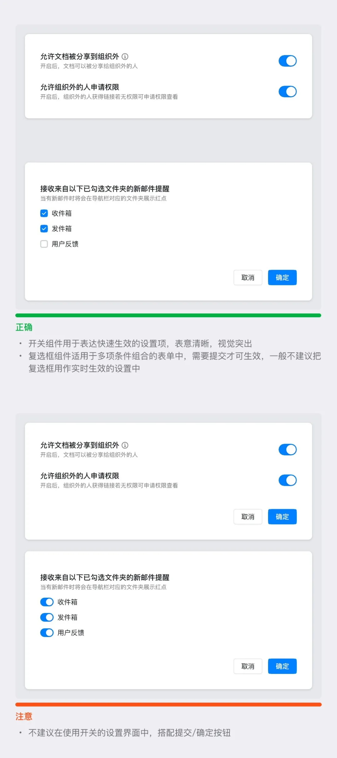
Switch buttons and checkboxes are frequently used in settings interfaces, and their semantics are somewhat similar—they both indicate whether a condition is selected or activated. This similarity can lead to misuse, resulting in outcomes that don’t meet user expectations.
1. Switch button: Represents an immediate state toggle (e.g., “On/Off,” “Enable/Disable”).
Use cases:
● Features that take effect immediately, such as turning on Bluetooth or enabling notifications.
● Situations where the user can see the result of the toggle in real time.
Recommendations:
● Use switches only when the state needs to change instantly.
● Avoid using switches for complex, multi-step operations.
2. Checkbox: Represents one or more independent options; selecting the box indicates activation or choice.
Use cases:
● Used for multiple-choice options (e.g., allowing users to select several interests at once);
● Used in scenarios where multiple items need to be selected before taking action (e.g., checking several items and then clicking “Delete”).
Recommendations:
● Use checkboxes for multiple selections or options that require confirmation;
● Avoid using checkboxes in situations where immediate feedback is critical, as this can confuse users.
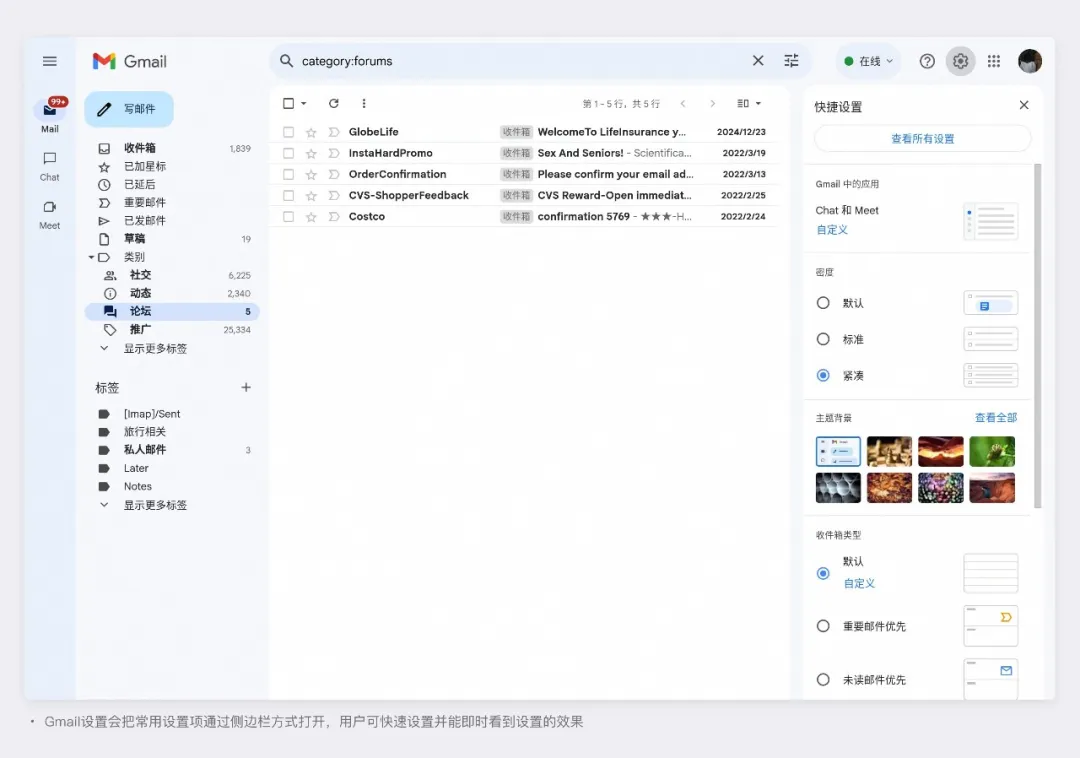
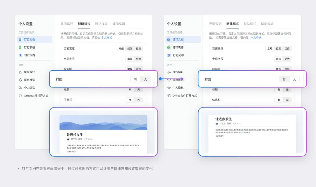
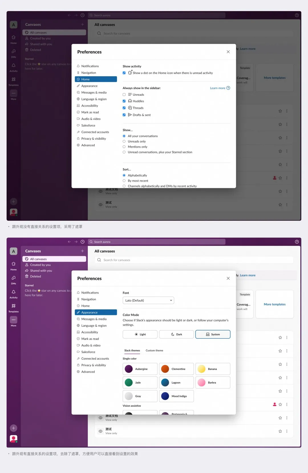
After making a setting change, users expect to see the results immediately—for example, how the interface has changed. If the design fails to account for this, and the results of the settings change aren’t communicated in a timely manner, users may not notice the impact until later. As a result, they might repeatedly adjust settings because the outcome doesn’t meet their expectations.
Recommendations:
1. Replace pop-up windows with a split-pane layout: Gmail’s settings appear in a sidebar, allowing users to see the effects of their changes on the mailbox interface in real time.
2. Provide a preview of the effect: DingTalk Docs’ interface preference settings use a dynamic visual illustration to help users understand how the interface will change after applying a setting.
3. Remove barriers to previewing changes: Slack’s settings page appears in a modal popup. When the settings don’t directly affect the current interface, a background overlay is displayed by default. However, if the settings change will have a visible impact on the interface, the overlay is removed, allowing users to see the effect directly.
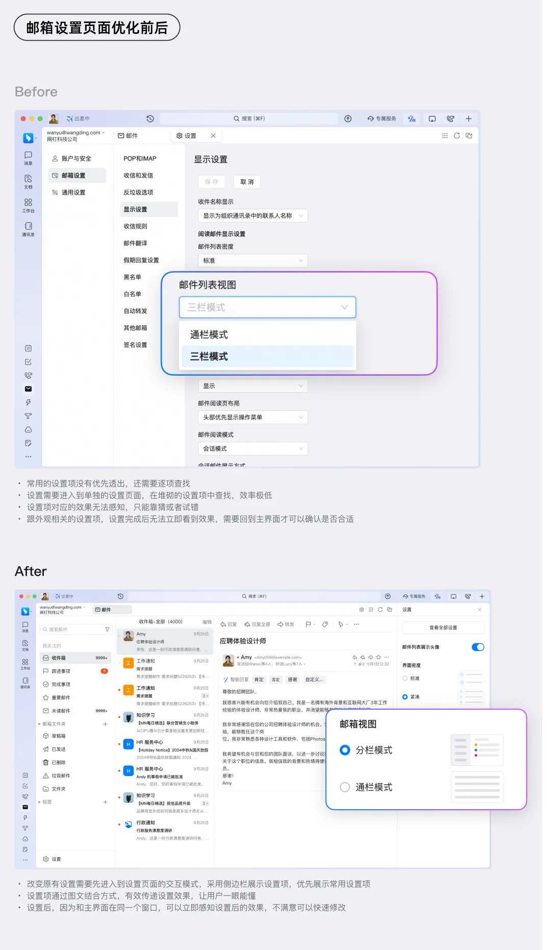
The settings interface for DingTalk Mail also had the following issues:
● Piling up too many settings options, with frequently used settings buried deep in the menu;
● Unclear descriptions of settings options;
● Difficulty perceiving the results of settings changes.
After optimizing based on the lessons learned above:
● Frequently used settings are now surfaced prominently, eliminating the need for inefficient searching;
● The settings page and the main interface are in the same window, so users can see the results immediately;
● Settings options are described using a combination of text and visuals, making them easy to understand at a glance.
Theoretical insights are only part of guiding practical design. The experiences shared here aim to strike a balance between user cognition and ease of use. Ultimately, specific use cases require tailored analysis. I hope these tips help you avoid common pitfalls and create better settings interfaces!
DomTech is DingTalk's official service provider in Macau, dedicated to providing DingTalk services to a wide range of customers. If you’d like to learn more about DingTalk platform applications, feel free to contact our online customer service or reach us by phone at +852 95970612 or by email at cs@dingtalk-macau.com. With a strong development and operations team and extensive market experience, we can provide you with professional DingTalk solutions and services!