

 Português
 English
Looking back at the evolution of the internet—from dial-up on desktops, to 5G mobile internet, and now to the support of artificial intelligence—technology is undergoing a dramatic transformation. In the future digital world, experiences will demand higher levels of immersion, engagement, and personalization. At the same time, B2B enterprises are increasingly seeking interfaces that are efficient, simple, and user-friendly. As we stand in 2025, B2B designers must keep learning, adapt to new technologies and trends, design with a strong focus on clients' business value, and emphasize practicality, inclusivity, and customizability in order to create outstanding products and services for enterprise clients.
Based on DingTalk's nearly 10 years of B2B product design experience, and considering that future B2B design trends will be characterized by diversity, intelligence, and human-centeredness, we have conducted in-depth research into multiple dimensions of B2B product design—including personalization, style and texture, interface layout, icons, and dynamic interactions. Together with you, we explore the essence and trends of B2B design, hoping to provide some valuable insights as we navigate the path of mastering B2B product design.
Today, we're sharing trends in B2B product layout design, which can help enterprises improve product usability, enabling employees to collaborate and work more efficiently, thereby enhancing overall business efficiency and competitiveness.
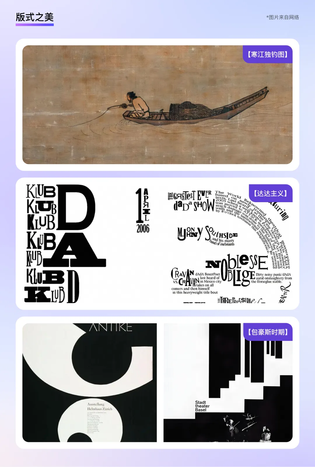
Capturing the Beauty of Layout from the Long History of Art
Throughout history, both domestically and internationally, it's easy to see that classic and aesthetically pleasing designs often rely on design aesthetics such as repetitive order, rhythmic pacing, symmetrical balance, negative space, and primary-secondary contrast. For example, in "Fishing Alone in the Cold River," the exquisite use of negative space allows us to experience the profound beauty of "nothingness is more than presence." During the Dadaism period, artists explored typography and seemingly free layouts, revealing the powerful impact of visual change. In the Bauhaus era, designer Armin Hofmann used grids, asymmetry, and minimal typographic contrast, allowing individuals to add uniqueness and imagination within unity.
Learning from history, within a limited layout space, visual elements such as text, images, and colors are organized and integrated purposefully to effectively convey information and create visual recognition. The beauty brought by layout design needs to be carefully captured:
1. The Beauty of Order
"Everything requires method; the world requires order." This famous quote comes from 18th-century British writer Jonathan Swift. Although originally not intended for design, it applies equally well to layout design.
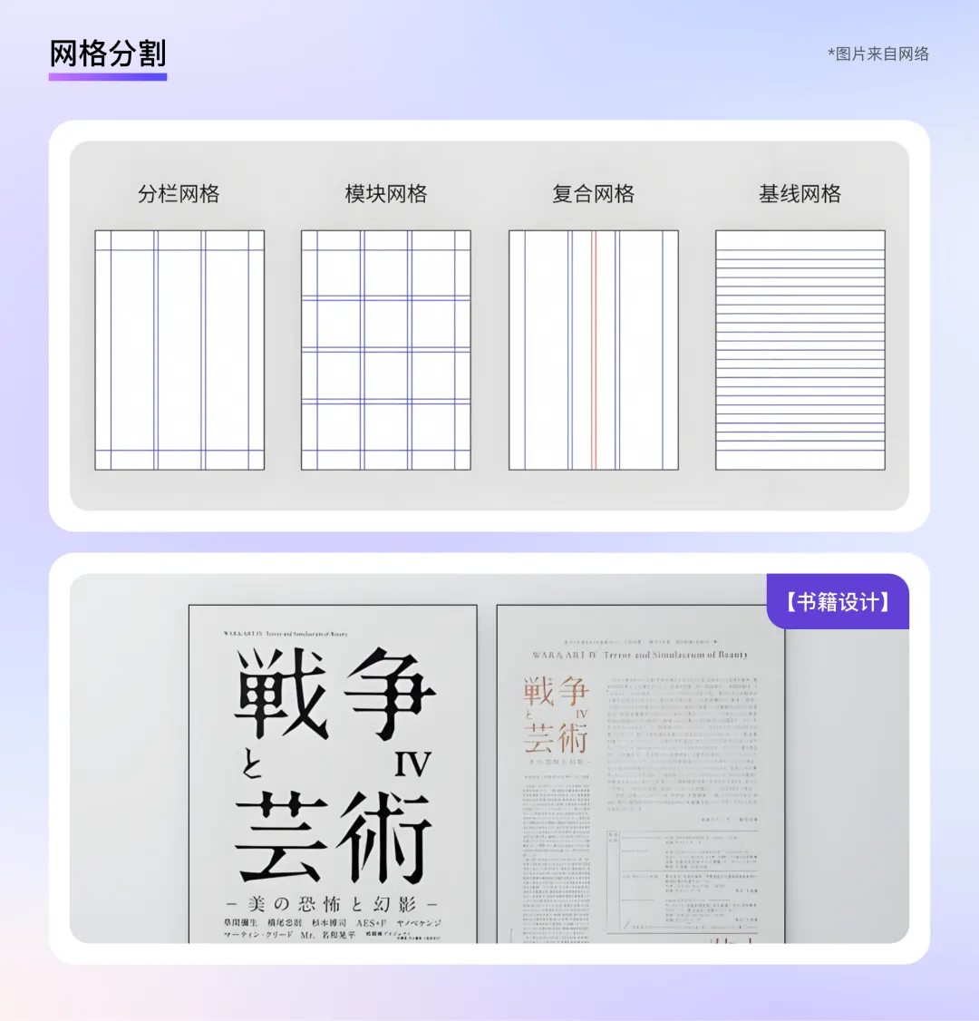
Grid Division
The beauty of order in a layout stems from the rational division of space and the orderly relationship between elements. A grid serves as an ideal tool: it not only imparts a sense of order but also enhances the readability of information on the page, making the design clear, well-structured, and efficient while ensuring consistent standards. In traditional media such as books, brochures, magazines, and packaging design, column grids are widely used—for example, the classic 1:1.4 golden ratio in book design originates from this approach.
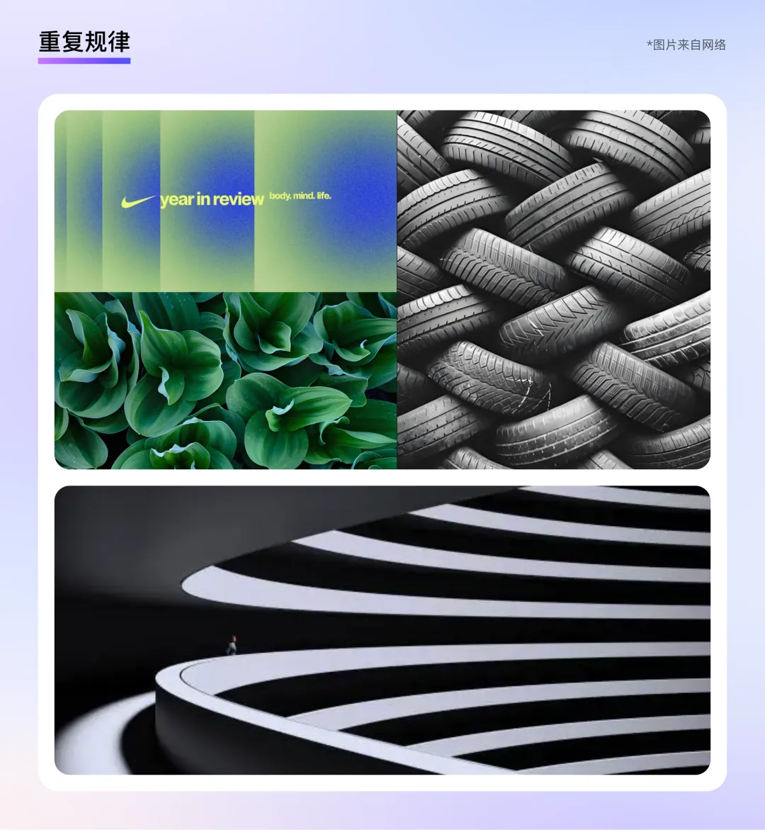
Repetitive Patterns
In nature, repetitive elements often appear in orderly and regular patterns, whether in shape, size, color, texture, direction, or spatial arrangement. In commercial design, techniques involving repetition are widely used in brand logos, posters, and illustrations. These techniques create a sense of stability, neatness, and subtle visual associations, helping brands develop memorable visual symbols and convey a technologically advanced brand identity.
2. The Beauty of Symmetry
The application of symmetrical aesthetics can be seen everywhere, from three-dimensional space to two-dimensional planes. In everyday life, the human body exhibits a naturally symmetrical structure; in art, Leonardo da Vinci's "Mona Lisa" uses axial symmetry in its composition, lending the figure a dignified and gentle appearance; in architecture, symmetrical structures create a sense of stability and solemnity; and in photography, symmetrical compositions represent a highly artistic form of visual communication.
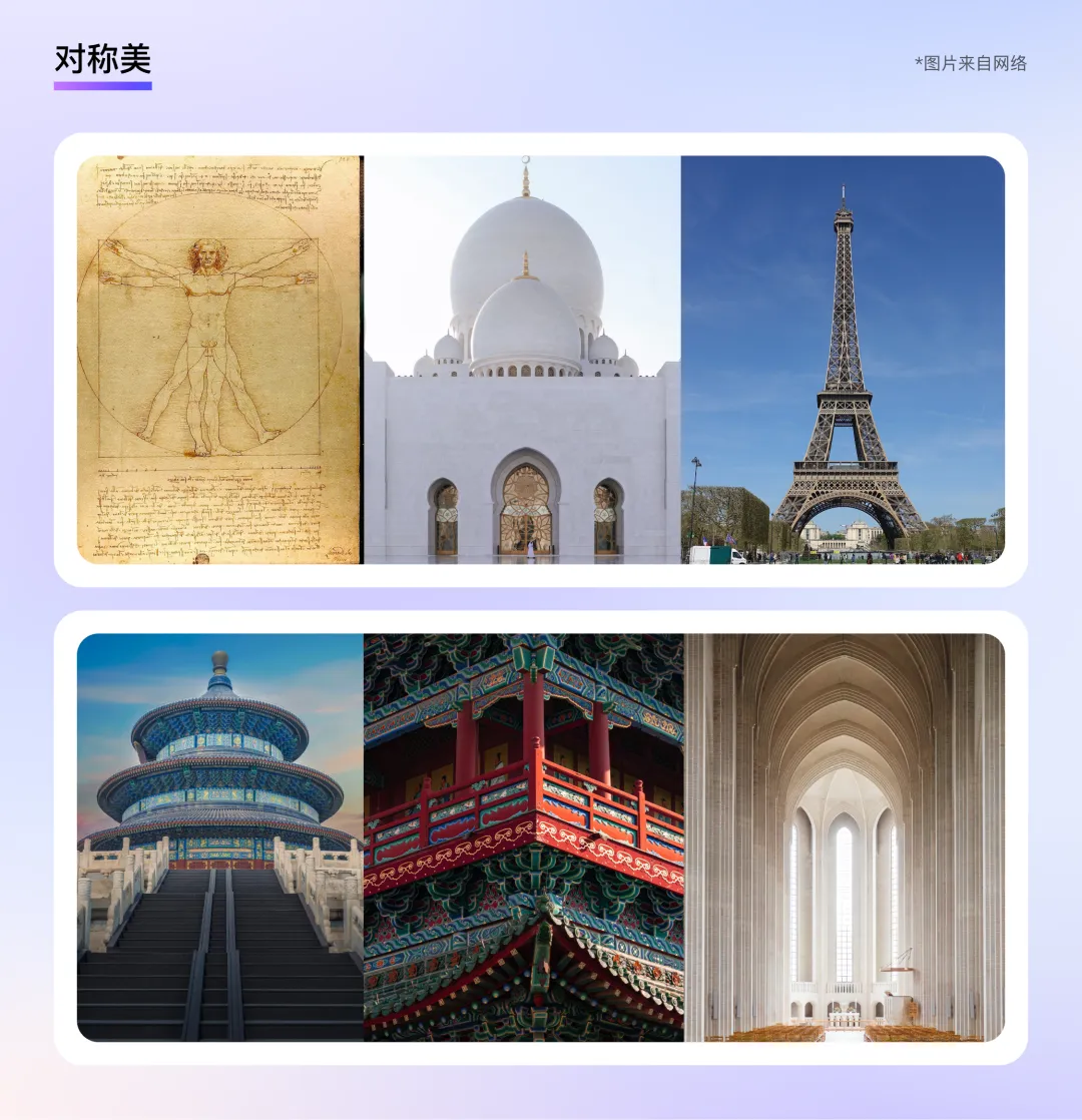
Proportional Balance
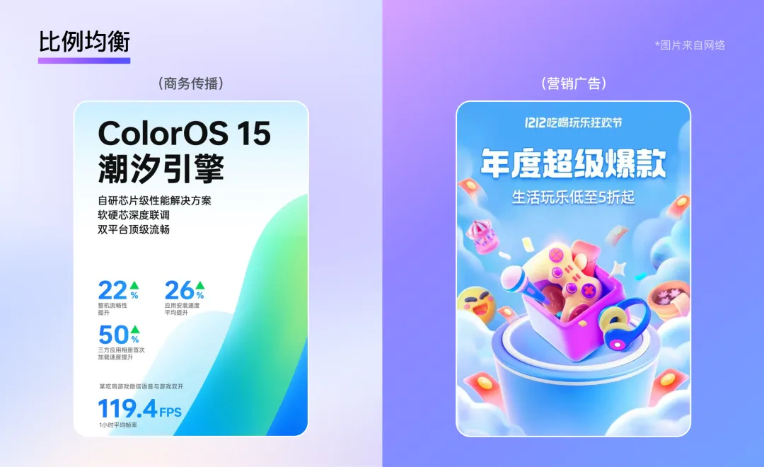
Theoretically, there are many ways to achieve symmetry: horizontal, vertical, center, radial, and other forms. For designers, the most critical factor is selecting the appropriate symmetry type based on the design content and target audience. For example, vertical symmetry is suitable for business communications, emphasizing professionalism and rigor, while radial symmetry can be used in marketing and advertising to add appeal and interest. In addition, adjusting proportions such as font size, color, and line thickness can quickly enhance the sophistication of a design. For instance, slightly offsetting text or using color contrasts can further enhance the dynamism of symmetrical aesthetics.
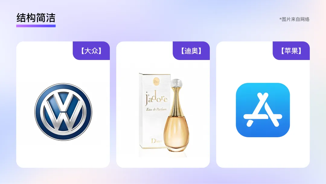
Simple Structure
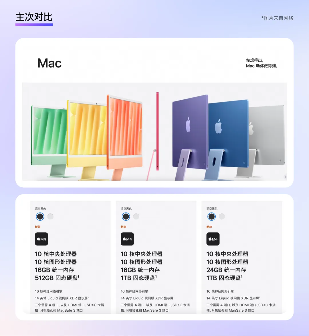
Symmetrical structures are typically simple and clear, as they are based on a mirror-image pattern, making the design or object's structure easy to understand. For example, the Volkswagen logo uses a vertically symmetrical combination of "V" and "W" to clearly convey the brand image; similarly, Dior's perfume bottle features a left-right symmetrical design paired with simple packaging copy, reflecting the brand's elegance and sophistication; Apple's App Store icon, with its central symmetry, appears both cohesive and comfortable—a style that aligns with Apple's long-standing commitment to simplicity and ease of use.
3. The Beauty of Rhythm
In addition to the beauty of order and symmetry, layouts also conceal a unique rhythmic beauty: through the combination and arrangement of elements, a rhythm akin to musical pauses and variations emerges, creating a balanced and harmonious visual effect that adds aesthetic appeal and artistic depth.
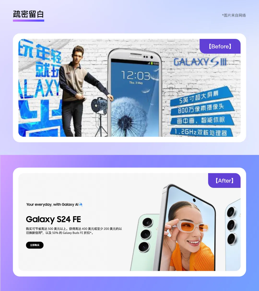
Sparse and Focused White Space
"Less is more." In layout design, clever use of white space is intended to better highlight the theme and leave room for imagination. Therefore, a layout does not necessarily become better simply because it is packed with information. In the early days of e-commerce, some companies required promotional posters to be filled with text and images, but they overlooked a crucial point: the lack of white space did not give users a sense of security and instead made them feel that the product quality was low. By contrast, layouts with ample white space not only convey a high-quality, sophisticated feel but also emphasize the theme, facilitate quick comprehension, and are more conducive to communication.
Primary-Secondary Contrast
Designers are often asked by clients to "make everything bigger and bolder," with the intention of establishing a clear hierarchy between primary and secondary information and drawing the user's attention to key details. A good contrast often involves differences in size, transparency, and color, creating a visual impact. For example, on Apple's official website, large, high-definition, and detailed product images serve as the main focus, occupying the central position and showcasing the product's appearance and features from all angles to capture the user's attention. Product names, key selling points, and special features are displayed in larger, eye-catching fonts below or beside the images, allowing users to quickly grasp the core information. Smaller text is used for product parameters, specifications, and purchase links, placed neatly at the bottom or side of the page. When users are interested in a product and want to learn more, they can easily find the additional information, creating a clear hierarchy of information and enhancing the user experience.
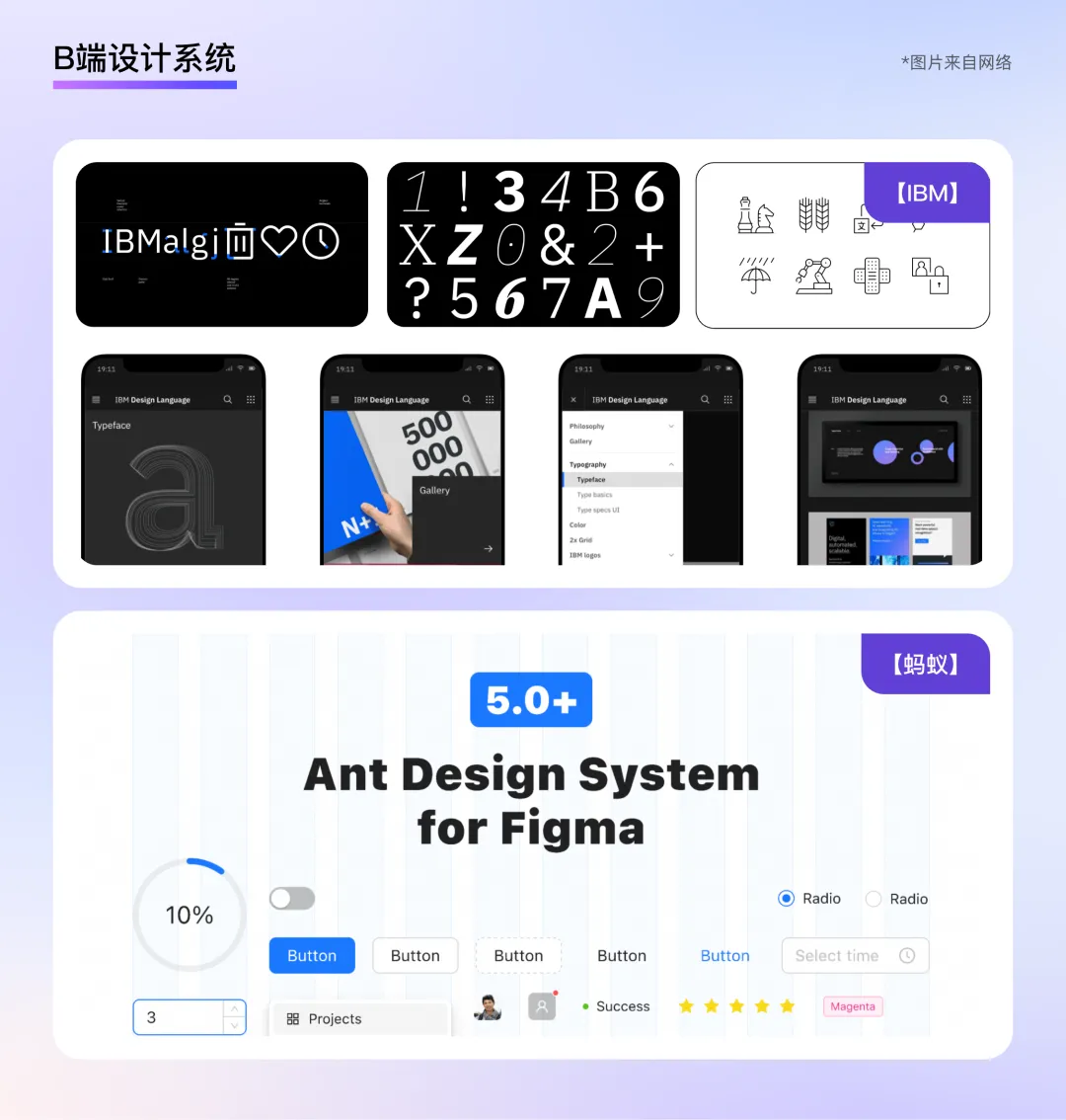
With the advent of the internet age, mobile phones and computers have become indispensable devices in daily life. At the same time, B2B product design in China and abroad has become increasingly mature, giving rise to a number of professional and well-established design systems, such as IBM (IBM Design Language), Google (Material Design), Microsoft (Fluent Design), and Ant Group (Ant Design). Design aesthetics such as order, symmetry, and rhythm have also been adopted in these systems.
Drawing Layout Design Trends from Real-World Cases
As Oliver Reichenstein said, "The purpose of typography is to optimize readability, accessibility, and usability while maintaining a balance with graphics." Good typography makes information easy to read, while chaotic typography discourages users from continuing to browse. Based on DingTalk's nearly 10 years of B2B product design experience, and through extensive research on outstanding real-world cases, we have identified the following core trends in B2B layout design for 2025:
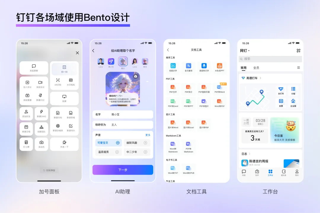
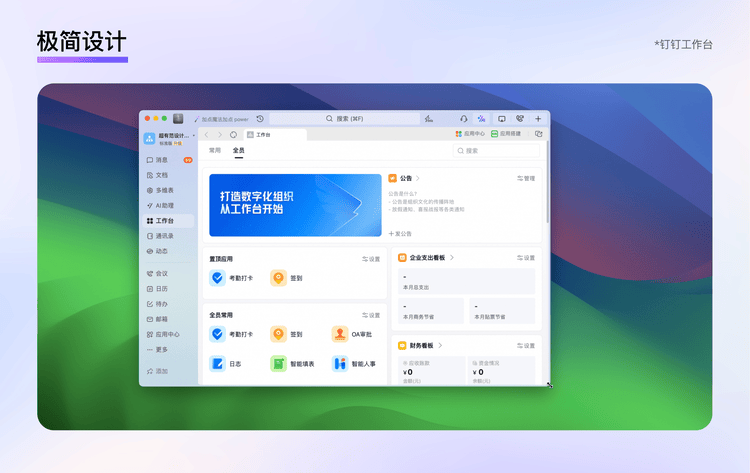
1. Bento Design
Bento originally refers to a Japanese lunchbox, where food is arranged in a grid-like pattern, creating a visually appealing and appetizing presentation that highlights the beauty of order. As early as 2008, this concept began to be applied in Android phone systems, with information, controls, and mixed components frequently appearing in grid-based layouts. In 2010, Windows Phone 7 also adopted the Metro design language. These can all be seen as sources of inspiration for today's Bento design, which gained widespread popularity after being adopted by Apple's design team.
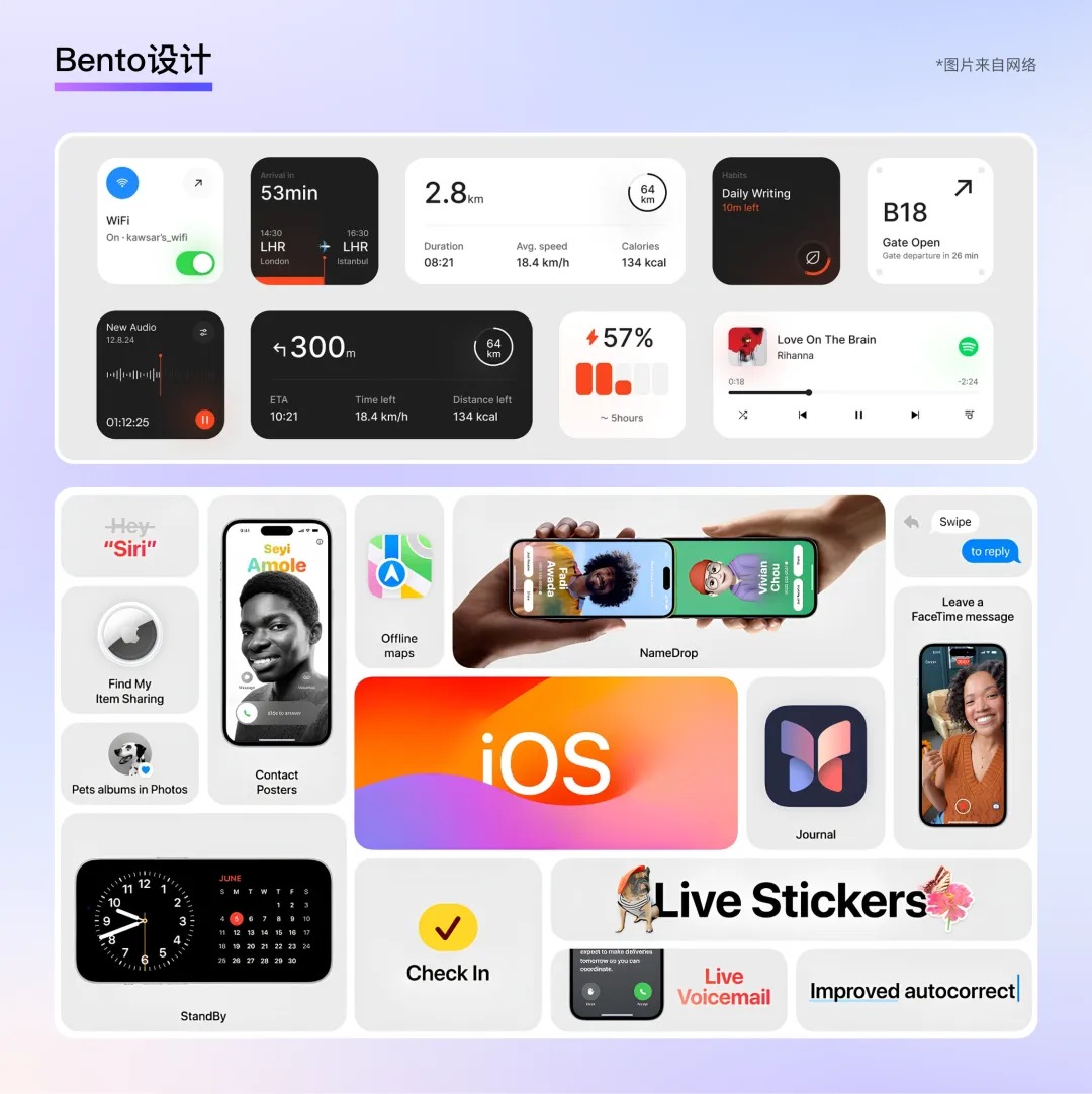
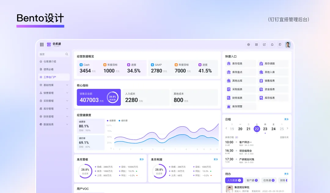
Bento design is based on a grid system, allowing users to focus on the information contained in each "box." In B2B products, many back-end management scenarios are moving toward this type of layout—for example, DingTalk's Yida management backend emphasizes a clear hierarchy of information and incorporates modular, streamlined features, bringing unprecedented cleanliness and order to the backend system while making complex operations easier to manage.
In other areas of DingTalk, Bento design is also widely used—for example, in DingTalk's "Home Plus" button, "More" menu, AI assistant, and official website.
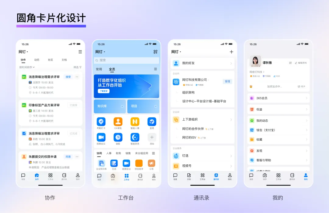
2. Rounded-Edge Card Design
As design styles continue to evolve, traditional square cards are gradually being replaced by softer, rounded edges, which convey a friendly, modern, and warm feeling. For example, DingTalk's core pages—such as "Collaboration," "Workplace," "Contacts," and "Me"—are gradually adopting a card-based design, making the information on the interface more concentrated, clear, and orderly.
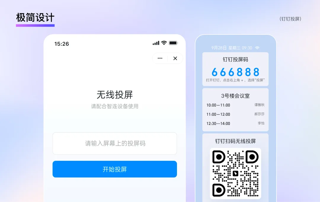
3. Minimalist Design
For many years, minimalism has been a dominant design trend, placing great emphasis on the beauty of white space and rhythm. However, in recent years, designers have begun to incorporate bold colors, large fonts, and attention-grabbing surprises into minimalist designs, creating a style that combines cleanliness with dynamism. In addition, minimalist design places greater emphasis on deep integration with interactivity: every element on the screen must have a clear function or purpose to guide the user's gaze and focus, ensuring that form follows function and information is conveyed more efficiently.
DingTalk, a smart mobile office platform serving over 700 million enterprise users, offers capabilities such as instant communication, multi-organization collaboration, digital management, and intelligent assistants. From the perspective of individual users, they often perceive the interface as complex, with high information density and a steep learning curve. How to maintain rich and useful product capabilities while creating a simple and efficient interface is a key consideration for designers. For example, in meeting scenarios, users can simply enter a screen-sharing code to instantly share content from their computers or phones without any wiring hassles—making the process quick and easy.
4. Responsive Design
To ensure a consistent and high-quality experience across different devices (such as computers, tablets, and smartphones), responsive layouts have emerged. They are compatible with various screen sizes and resolutions, allowing page elements to be displayed appropriately: text remains legible, images appear fully, and interactions remain smooth and intuitive. There are no issues with layout distortion or incomplete content display, and the need for developing and maintaining multiple versions of a product is reduced, saving development and maintenance resources. For example, DingTalk's Workplace was designed and developed with cross-device compatibility and a consistent user experience in mind.
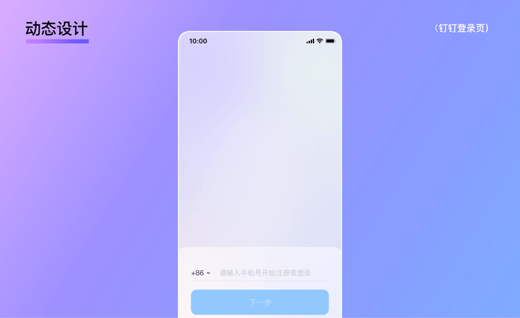
5. Dynamic Design
With the development of digital technology, dynamic layouts use movement and change to quickly capture the audience's attention and effectively increase content engagement. In B2B brand promotion or product launches, dynamic posters combine static visuals with subtle looping animations, helping corporate brands stand out in a saturated digital environment. The same principle applies to DingTalk—for example, on the "DingTalk Login Page," during the first login, a dynamic guide helps convey the value of DingTalk's products to users in a more direct and orderly manner. Similarly, in the introduction of "DingTalk Content," the dynamic reading order and rhythmic changes help users better understand and absorb the content.
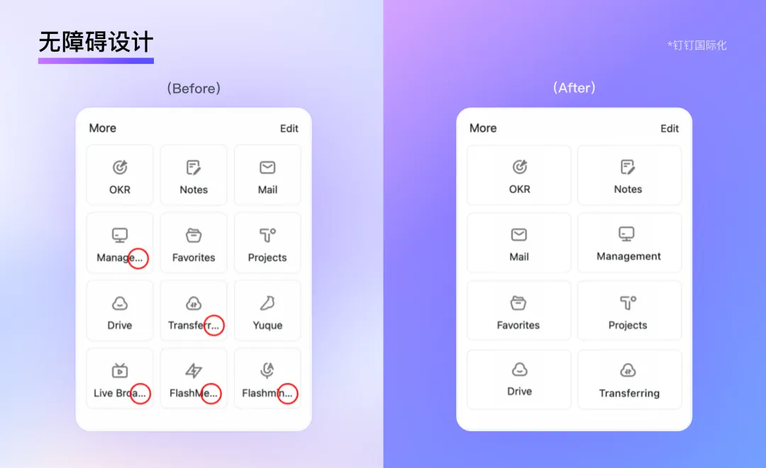
6. Accessible Design
When designing products and services for enterprise or organizational users, designers must fully consider the abilities and needs of all users, including those with physical, sensory, or cognitive disabilities, to ensure that everyone can use the product or service equally, conveniently, and efficiently. For example, buttons and input fields should maintain sufficient spacing to avoid crowding and make them easier to click and input; text should have a high contrast with the background color—for instance, black text on a white background or white text on a black background—to make it easier for visually impaired users to read; colors should avoid using a single hue to distinguish information—for users with color blindness or color weakness, shapes, icons, or additional text should be used to aid differentiation. Moreover, for B2B products like DingTalk that cater to a global audience, multilingual support is essential to accommodate users with different language backgrounds.
Conclusion
As stated in "Simplicity Is the Ultimate Sophistication," the secret to creating a simple user experience lies in shifting complexity to the right place. The goal of design is not to eliminate all complexity but to place it in the most appropriate location. B2B product design is a complex and challenging field. By gaining deep insights into B2B users and business scenarios, simplifying information architecture, and creating clear and intuitive interface layouts, enterprises can significantly enhance product usability, helping employees collaborate and work more efficiently, and ultimately boosting overall business efficiency and competitiveness. In the future of B2B product design, we must always put the user experience first, continuously explore and innovate interface layout design methods and strategies, and create a more friendly and convenient experience for B2B users.
This issue draws on DingTalk's nearly 10 years of B2B product design experience. Considering that future B2B design trends will exhibit characteristics of diversity, intelligence, and human-centeredness, we have explored the essence and trends of B2B design through three modules: product personalization, style and texture, and interface layout. Next, we will continue with a second installment, conducting in-depth research on B2B icons, dynamic interactions, and client-facing materials, with the hope of advancing together on the path of mastering B2B product design.
DomTech is DingTalk's officially designated service provider in Macau, specializing in providing DingTalk services to a wide range of customers. If you'd like to learn more about DingTalk platform applications, feel free to contact our online customer service or call +852 95970612 or email cs@dingtalk-macau.com. We have an excellent development and operations team with extensive market service experience, ready to provide you with professional DingTalk solutions and services!