

 Português
 English
Looking back at the evolution of the internet—from dial-up on desktops to 5G mobile internet and now the rise of artificial intelligence—technology is undergoing a dramatic transformation. In the future digital world, user experiences will demand greater immersion, engagement, and personalization. At the same time, B2B enterprises are increasingly seeking interfaces that are efficient, simple, and user-friendly. As we stand in 2025, B2B designers must continuously learn, adapt to new technologies and trends, and design with a strong focus on clients' business value. By emphasizing practicality, inclusivity, and customizability, they can create outstanding products and services for enterprise clients.
Based on DingTalk's nearly 10 years of B2B product design experience, we recognize that future B2B design trends will be characterized by diversity, intelligence, and human-centered approaches. We have conducted in-depth research across multiple dimensions—including B2B product personalization, style and texture, interface layout, icons, and dynamic interactions—to explore the essence and trends of B2B design. Our goal is to provide some meaningful insights as we navigate the path of mastering B2B product design together.
Today, we're focusing on B2B product style & texture—how it shapes brand identity for enterprises and delivers emotional value to individual users.
UI Design Styles Through the Lens of Technological Advancement
Phase 1: The Emergence of Style
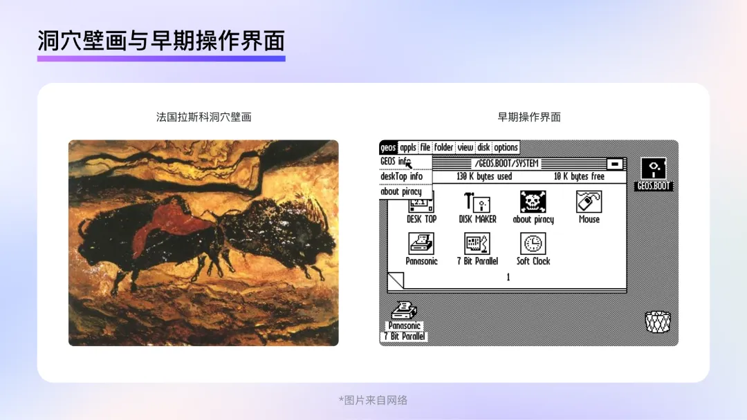
The 1970s and 1980s marked the dawn of computer graphical user interfaces. Much like early painting, when primitive humans relied solely on charcoal from dying fires and painted on cave walls and rocks, early UI designers lacked both professional design software and sufficient display capabilities in computers. In this phase, clarity and unambiguous meaning on the screen took precedence over stylistic flair. Observing the operating interfaces of that era, it's clear that designers sought to reduce users' unfamiliarity with computer interfaces through a more concrete, representational style. Though this style couldn't yet be called "skeuomorphic," it laid the groundwork for the emergence and development of true skeuomorphism.
Phase 2: Skeuomorphic Style
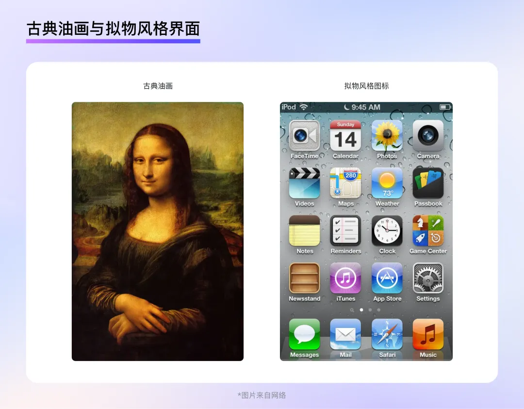
In 1995, computer display technology underwent a significant leap forward. The release of Windows 95, support for true color, and the launch of Photoshop 5.0 empowered designers to break free from the limitations of earlier tools and display mediums. It was as if prehistoric cave painters had gained access to brushes, paints, and canvases. Designers' creative space and ability to render realism expanded dramatically.
At the same time, personal computers and mobile phones began to spread, making graphical user interfaces no longer exclusive to researchers and professionals but an integral part of everyday work and study for ordinary people. To help users unfamiliar with graphical interfaces quickly recognize the functions represented by icons, the best approach was to replicate real-world objects in the interface—thus driving the development of the skeuomorphic style.
Skeuomorphic designs mimic the shapes and textures of real-world objects, using effects such as layering, highlights, textures, materials, and shadows to recreate physical forms. This allows users to quickly familiarize themselves with graphical interfaces and product functions at a low learning cost, guiding them through interactions in a way that aligns with their daily habits and intuition.
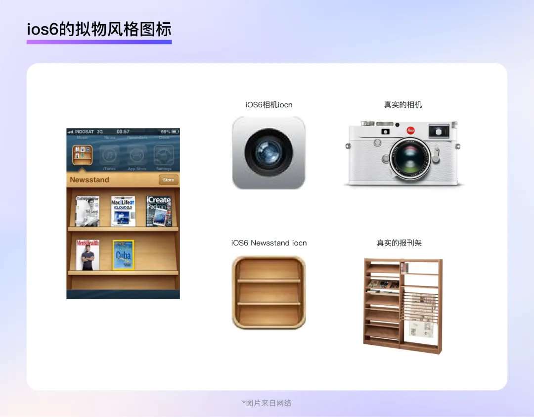
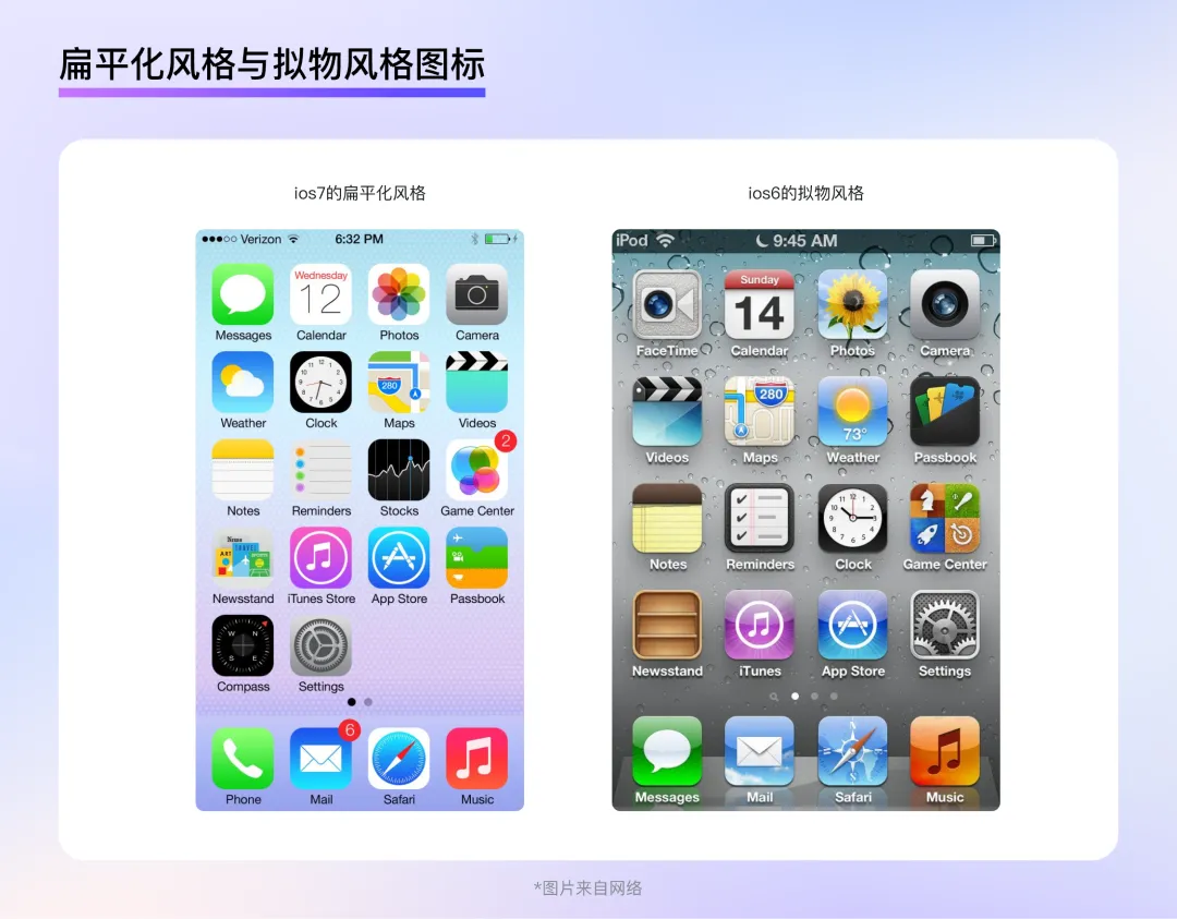
For example, the camera icon in iOS 6 features highly detailed depictions of lens elements, making it easy for users to associate it with the actions they perform with a real camera—a powerful aid in understanding and mastering product functionality. Similarly, the bookshelf icon in iOS 6 is equally impressive: it not only faithfully reproduces the structure and texture of a real newspaper rack but also displays magazines inside the shelf, allowing users to see the contents as if they were looking at a physical bookshelf. The small icon packs an incredible amount of information.
Phase 3: Flat Style
Around 2013, smartphones became widely adopted across major countries and regions worldwide. Statistics show that smartphone penetration exceeded 50% in many developed nations, while developing countries also saw rapid growth. Most users were already familiar with graphical interfaces and no longer needed highly realistic styles to understand the meaning and functions behind graphical elements. Meanwhile, the flood of information and apps on smart devices made the intricate textures, materials, and lighting effects favored by skeuomorphic design redundant. How to manage this information overload became a primary concern in UI design. Just as 19th-century photography challenged traditional realistic painting, pushing artists to rethink the direction of art, the peak of skeuomorphic realism signaled a turning point in its evolution.
In September 2013, iOS 7 was released, introducing a flat design style to UI for the first time. This style abandoned the realistic lighting, textures, and excessive details of skeuomorphic design, as well as volume and any elements that might interfere with recognition. It retained only the most critical information for users, resulting in a clean and minimalist visual appearance.
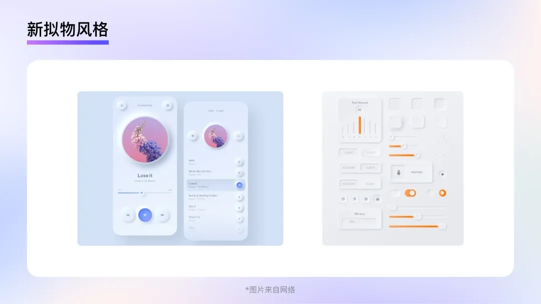
However, extremes tend to reverse: the extreme simplicity of flat design can feel cold and uninspiring to long-term users, leading to the emergence of a "neo-skeuomorphic" style.
Neo-skeuomorphism blends elements of both skeuomorphic and flat styles. It employs more realistic lighting and three-dimensional effects, with elements often protruding or recessed on the interface, creating a visually layered effect. However, in terms of color and shape, it leans more toward flat design, with graphics often simplified and abstracted, paired with a few bold, subjective colors. Yet, neo-skeuomorphism relies heavily on shadows and three-dimensional effects to distinguish interface elements, making it difficult to represent complex information hierarchies. Its subtle contrast ratios also hinder accessibility, preventing the style from gaining widespread adoption.
B2B Design Trends in the AI Era
In 2022, ChatGPT was launched, bringing natural language processing to unprecedented heights. That same year, MidJourney and Stable Diffusion captured public attention, showcasing the allure of AI-generated imagery. As AI applications and websites sprang up like mushrooms after rain, industries scrambled to upgrade their apps with AI capabilities. This backdrop presents a new challenge for UI design: how can design reflect an app's AI capabilities and an enterprise's intelligent mindset?
Trend 1: Varied and Rich Colors
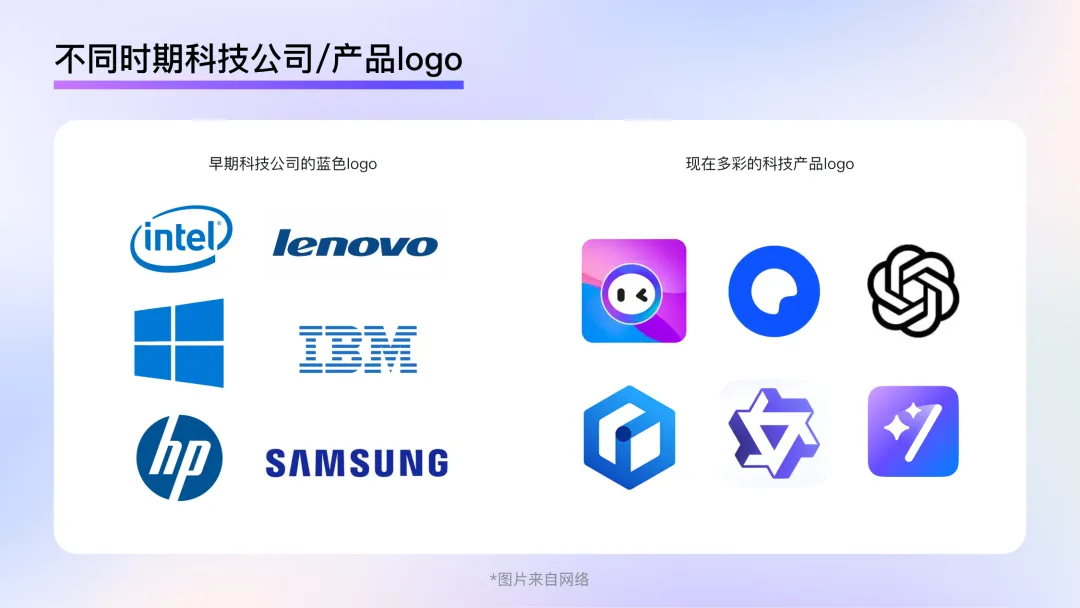
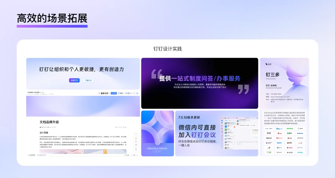
Color plays a crucial role in B2B design, delivering a strong, immediate impression and serving as users' first encounter with a product or brand. For example, blue has long been associated with B2B or tech products—brands like Intel, Microsoft, Lenovo, Dell, and IBM use blue to convey a sense of simplicity, futurism, and high technology. However, this standard is not set in stone. More and more B2B designs are embracing rich, diverse colors to express the dynamic, ever-changing nature of intelligence. The expression of technological sophistication is no longer limited to monotonous cool tones; instead, it has become far more varied.
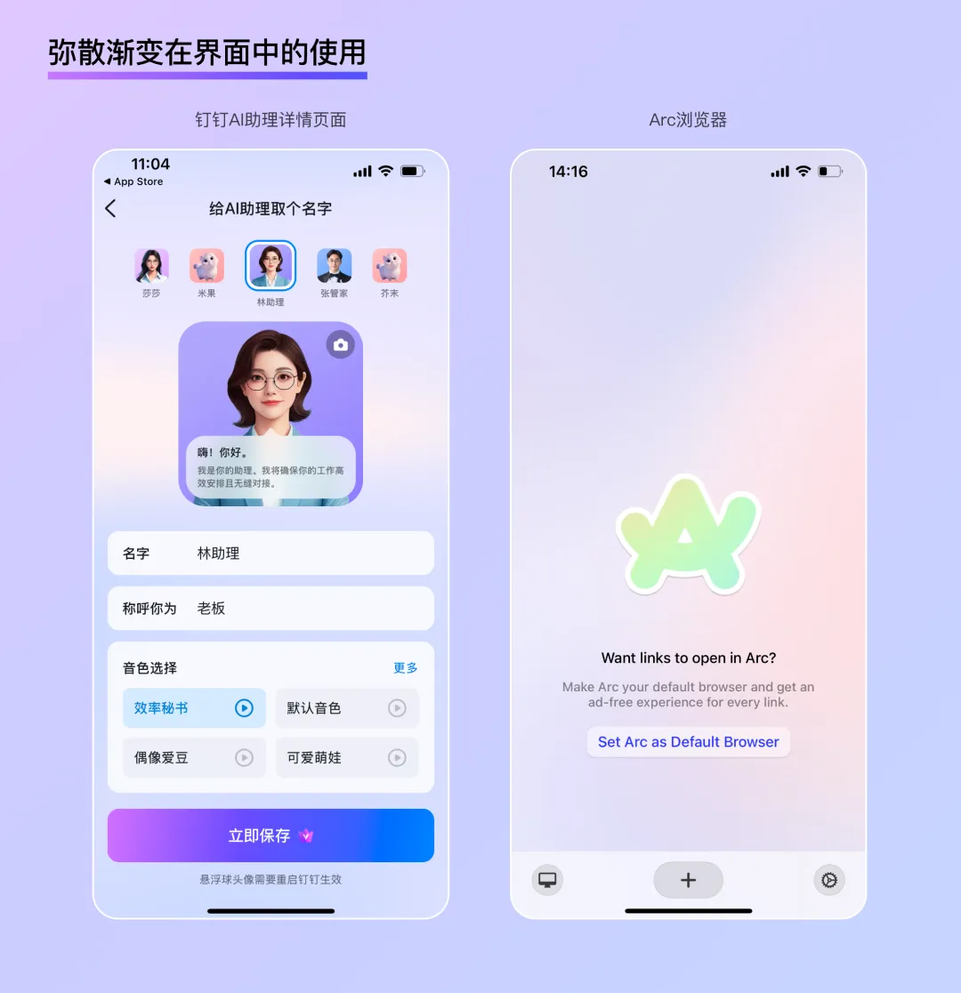
Diffused Gradient
A diffused gradient is a special type of gradient that blends multiple colors using a blurring effect. The irregular blending of colors and the unpredictable gradient pattern give diffused gradients a strong atmospheric and expressive quality. The colors seem to diffuse slowly into a void, creating a delicate, soft, and dreamlike effect—perfect for enhancing localized moods within an interface.
Excellent Scene Adaptability
In B2B design, screen efficiency and readability are paramount. Using graphics or illustrations to enhance the atmosphere often requires more space, and in web adaptations, overlapping text and images can create recognition challenges. Diffused gradients, with their uniform blur and brightness, add richness to a scene without creating visual focal points, making them less prone to text-image overlap during adaptation. This makes them highly versatile for various application scenarios.
Efficient Scene Expansion
By retaining some relatively sharp outlines while adjusting the gradient, diffused gradients can create a hybrid virtual-real visual experience, adding dynamism and depth to a scene—like real objects floating behind frosted glass. This spatial effect gives colors a tangible form—a wave, a sphere, a hill—and, when paired with simple typography, can transform into a poster, banner, or push notification cover. This provides an efficient solution for fast-paced B2B design iterations.
Dynamic Variation
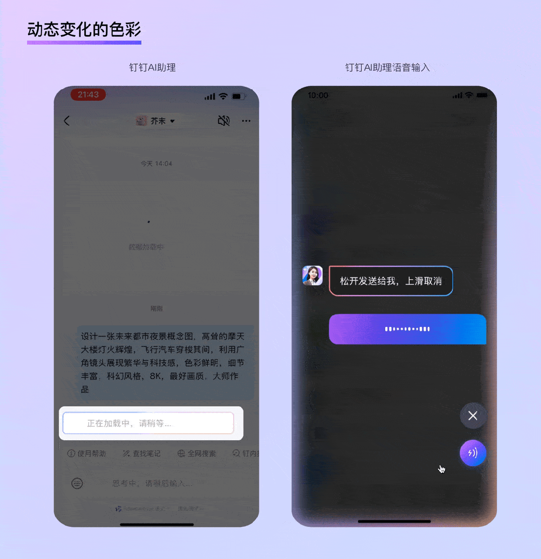
According to data, AI-generated images in mobile apps typically take between 10 and 120 seconds to generate, AI searches average between 2 and 15 seconds, and professional AI writing tools produce text in 3 to 30 seconds...
AI applications often involve lengthy waiting periods. Dynamic color changes can reduce users' anxiety during these waits, and the constantly shifting, flowing colors subtly signal that the process is still underway. For example, while waiting for DingTalk's AI assistant to respond, chat bubbles display colorful, shimmering light effects; during voice interactions with the AI assistant, the edges of the screen glow with dynamic, multicolored lights, indicating that the AI is active.
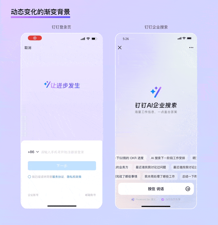
In addition, full-screen dynamic gradient backgrounds are ideal for feature or app homepages with minimal information. For instance, on DingTalk's login page, simple text animations occupy nearly two-thirds of the screen, complemented by a dynamic gradient background that not only clearly communicates the brand's intelligent mindset but also adds a strong sense of ceremony to the "login" action. A similar example is DingTalk's AI search feature homepage, where a large area of flowing, dynamic gradients visually conveys the brand's intelligent nature, while ample white space makes the functional description of DingTalk AI Enterprise Search stand out even more.
Trend 2: Subtle, Restraint Texture
Although neo-skeuomorphic styles have not gained widespread adoption, their rise and fall highlight the fundamental tension between function and aesthetics—a tension that lies at the heart of B2B design. On the one hand, users want aesthetically pleasing designs to enhance their work experience; on the other hand, they don't want flashy colors or decorations to distract them from productivity. Enterprises, meanwhile, seek to shed dull, rigid stereotypes while maintaining a professional, high-tech image that inspires trust. Subtle, restrained textures offer a solution to strike this balance.
Glassmorphism
Glassmorphism is a design trend that gained popularity at the end of 2020. As the name suggests, it involves a skeuomorphic representation of glass. Compared to neo-skeuomorphism, glassmorphism's most notable advancement lies in its clever use of glass to address issues such as unclear element boundaries and difficulty representing complex hierarchies. Its key characteristics include:
Transparency:
Thanks to the translucent nature of frosted glass, multi-level interfaces achieve a unique blend of virtual and real. The transparency also subtly indicates the user's current position, enabling more immersive presentation of focused information while reducing the psychological burden of "jumping" between pages through a "layering" interaction logic.
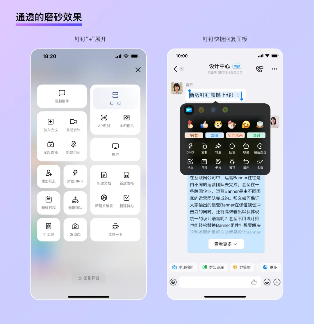
Levitation:
Traditional skeuomorphic designs often create a "ground" and then place icons on top. Glassmorphism, by contrast, builds a "zero-gravity" virtual space, giving interface elements a distinct sense of levitation and lightness. This makes it particularly suitable for conveying a sense of technology in B2B settings. Combined with shadows and virtual-real contrasts, users can clearly perceive differences in height among elements, ensuring both information readability and a more tactile, interactive feel.
Mildness:
Due to the physical properties of frosted glass, the page background becomes exceptionally soft after being blurred by a "glass layer," akin to the "diffused gradient" described earlier. The result is a uniform brightness with no visual focal points, ensuring excellent legibility for foreground text and UI controls whether the design is static or dynamic. In glassmorphic designs, thin, subtle borders are often used to reinforce the physical texture. This dual role—as both a border and a "glass" thickness—allows cards to appear on the interface with just the right level of contrast.
In summary, glassmorphism strikes an excellent balance between realism and simplicity, bringing both authenticity and playfulness to otherwise dry B2B designs while maintaining readability in complex information scenarios. Moreover, the smooth, transparent qualities of glass open up new avenues for visually expressing a "tech" aesthetic.
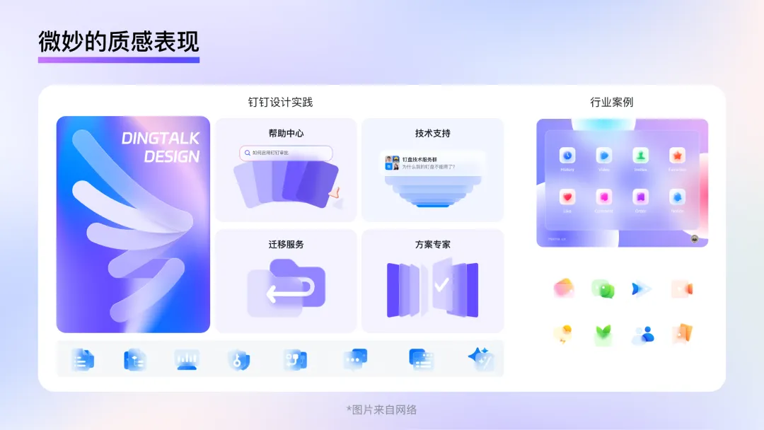
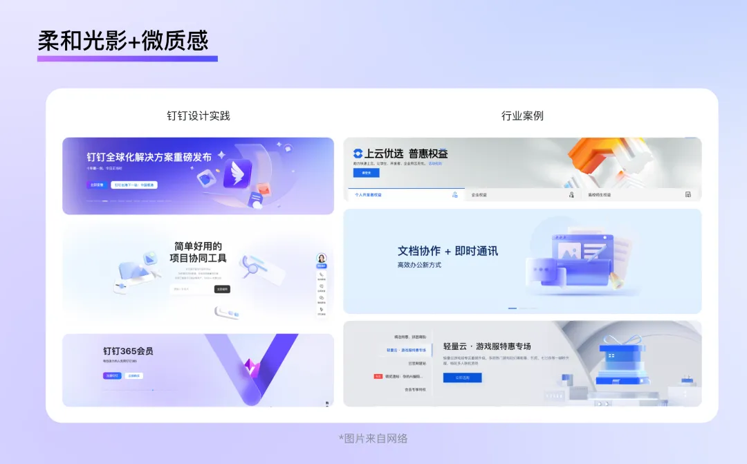
Soft Lighting + Subtle Textured Materials
Unlike C2C design, which often uses bold lighting effects to attract users, B2B design tends to be more subdued. The homepages of Alibaba Cloud, WPS, DingTalk, and Tencent Cloud all feature very soft ambient lighting. This lighting design maintains overall brightness without creating strong directional light or pronounced shadows. In terms of materials, these sites also favor diffuse reflective materials with minimal highlights or reflections, or subtly textured frosted glass. The overall visual impression is calm and clean.
Trend 3: Clear and Concise Graphics
Graphics serve two key roles in design: first, they enhance the aesthetic appeal of a page; second, they supplement textual information by conveying specific meanings. Good graphic design not only elevates the mood of an entire page but also helps users better understand textual content.
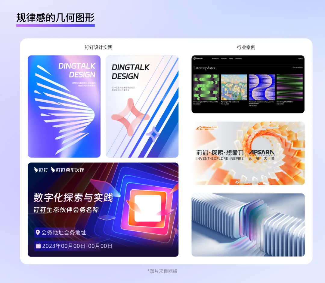
Regular Geometric Shapes
In B2B contexts, graphics are often used to express abstract concepts such as PaaS, servers, AI, usage, technology, and traffic—concepts that don't directly correspond to a specific shape. Using regular geometric shapes seems like a good choice. After all, these technical concepts are rooted in the combination of 0s and 1s in binary code, and the process of arranging geometric elements in an organized way—or even generating new forms—is akin to writing code.
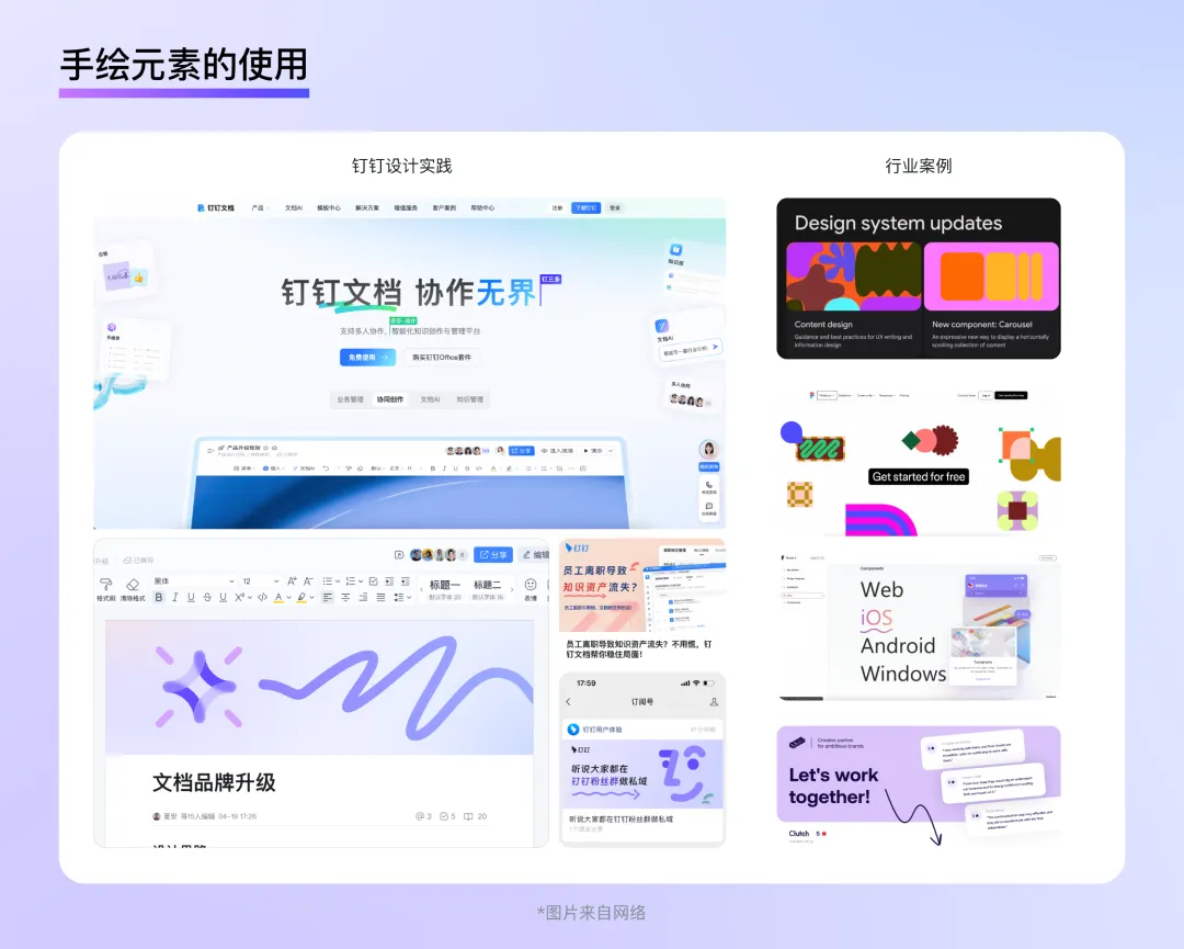
Simpler, More Efficient Hand-Drawn Elements
In today's B2B design landscape, there is growing emphasis on emotional care and the user experience. Incorporating hand-drawn elements into a page or using hand-drawn illustrations as supporting visuals can quickly bridge the gap between brands and users, fostering a youthful, approachable brand image while enhancing users' enjoyment of the product. These lighthearted graphics are simpler than traditional illustrations or 3D modeling, feature vibrant colors, boast strong expressiveness, and come at a lower design cost—making them ideal for smaller, more aesthetic product visuals.
For example, Google's Material Design language makes extensive use of abstract, brightly colored hand-drawn elements as supporting graphics. These designs emphasize color without overly detailing shapes, interweaving seamlessly with text and instantly enlivening dark backgrounds. Figma's website follows a similar approach: designers abstract tools like lines, wireframes, anchors, and pointers into illustrations that are both simple and visually distinctive, reflecting the brand's unique character.
In addition, hand-drawn lines can efficiently indicate hover states, highlight important text, or guide user actions. Simple arrows or wavy lines can directly draw users' attention to key information—just like circling important points in a textbook during school days—a natural and friendly way to communicate. It's as if the app's designer is quietly whispering a tip in the user's ear rather than bluntly shoving information in front of them.
Conclusion
Whether it was the hyperrealism of the skeuomorphic era, the minimalism of the flat design period, or the vibrant hues of the AI age, the evolution of design styles has always been driven by technological progress, with the ultimate goal of enabling users to enjoy the convenience brought by technology more easily and conveniently. A well-designed B2B style not only helps enterprises showcase their brand identity and technological prowess but also enables individual users to complete their work tasks more efficiently and pleasantly. In future B2B product design, we must continue to prioritize the principle of "form follows function" and "people-centric design," exploring styles that are better suited to specific business scenarios to deliver a more comfortable and natural visual experience to users.
This concludes our discussion on B2B design trends—specifically, the style aspect. Next, we'll delve into the layout dimension to further explore the essence and future directions of B2B design.
DomTech is DingTalk's official designated service provider in Macau, dedicated to providing comprehensive DingTalk services to a wide range of customers. If you'd like to learn more about DingTalk platform applications, feel free to contact our online customer service or reach us by phone +852 95970612 or email cs@dingtalk-macau.com. With a skilled development and operations team and extensive market service experience, we're ready to provide you with professional DingTalk solutions and services!