

 Português
 English
Have you ever had this experience: When you are completely immersed in a task, time seems to stand still, all external distractions fade away, and you feel an unprecedented sense of focus and fulfillment? Psychologist Mihaly Csikszentmihalyi calls this state "flow." In the world of document creation, we aim to provide every creator with this very experience—so that, the moment you start typing, you can fully immerse yourself in the act of writing.
From Busy to Immersed: Exploring the "Flow" Experience in Document Creation
In today's office environment, documents are undeniably crucial as knowledge productivity tools. A comfortable document-editing environment not only boosts individual work efficiency but also enhances collaboration and communication among team members. However, traditional document editors often suffer from complex interfaces and cumbersome operations—issues that easily disrupt creative flow. That’s why we strive to optimize the document-creation and -reading experience, helping users effortlessly enter a flow state, enjoy the satisfaction of focused creation and productive outcomes, and appreciate the thoughtfulness and smoothness behind our document products.
Make Document Editing a Joyful Journey
You open a page, and information comes at you like swirling snowflakes—every element seems to be shouting, "Pay attention to me!"—leaving you overwhelmed. Isn’t this a scene you face every day? As efficiency tools, documents come packed with many features, and their cluttered interfaces can easily distract users, scattering their attention and making it hard to enter a flow state. Therefore, reducing interface distractions and creating a quiet, focused creative environment is a key step toward achieving a document-based flow experience.
1. Interface Noise Reduction: Creating a Focused Creative Space
Minimalist Layout: Visual "Decluttering"
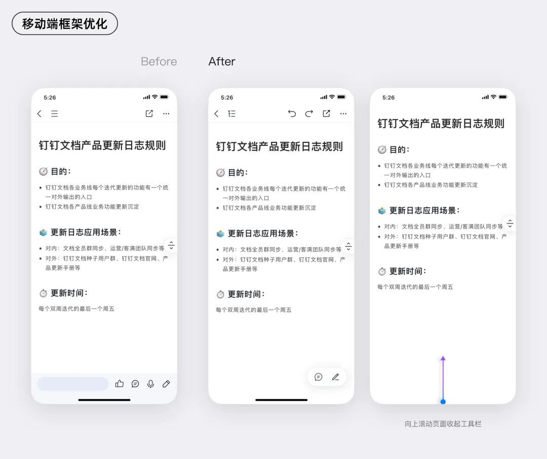
Imagine opening a document and being greeted by a clean, spacious editing area with no extraneous elements to pull your attention away. This is exactly what DingTalk Docs achieves through its minimalist layout. On desktop, scattered tools are consolidated; unnecessary color blocks are removed; and major components like the toolbar and directory tree adopt a collapsible design, ready to expand with a single click when needed.
The mobile version follows the same minimalist principle. The tool bar is streamlined, with fewer functions, and automatically hides during browsing, allowing users to scroll through document content as if they’re reading an e-book. When editing is required, a simple tap on the screen brings up the toolbar, putting essential functions just a swipe away.
Whether you’re working efficiently at your desk or capturing inspiration on the go, you can stay focused in a clean, distraction-free creative space where your thoughts aren’t pulled in too many directions.
Element Optimization: Protecting Focus Through Attention to Detail
Beyond the overall layout, the way each embedded element appears within a document also plays a critical role in determining whether you can remain immersed while browsing.
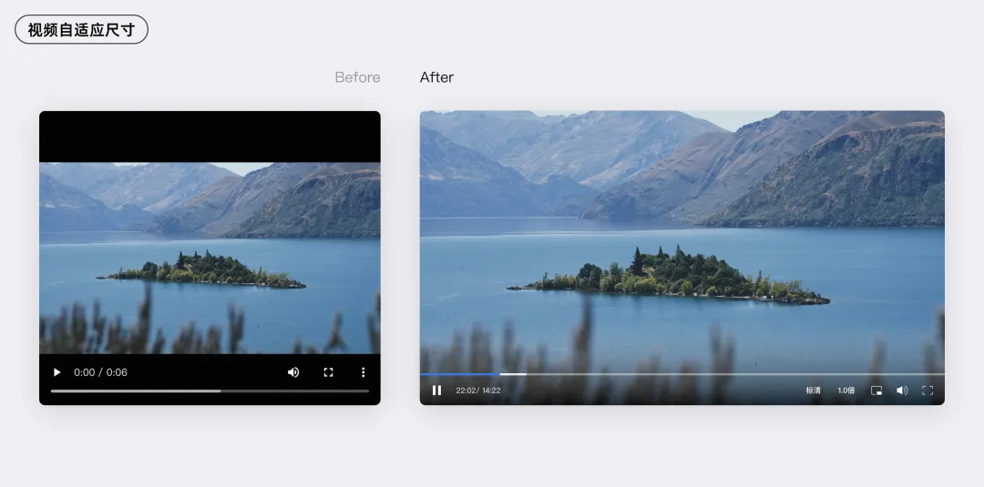
Take inserting a video, for example. Before optimization, fixed width and height settings often resulted in large black bars on either side of the video, which was visually jarring—and enough to drive anyone with perfectionist tendencies crazy. After optimization, the document automatically recognizes the dimensions of the uploaded video, intelligently cropping or stretching it to display only the main content area.
2. Shorten the Path: Enable Seamless Creation
Besides text editing, you’ll also encounter scenarios like style adjustments and formatting. If frequently used tools require long, complicated workflows, they can be a major source of frustration, constantly interrupting your creative flow. Streamlining the processes for high-frequency tools not only boosts document-creation efficiency but also helps users stay immersed in their work.
High-Frequency Tools, Shortened Paths
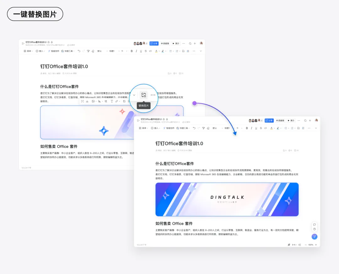
Take image editing as an example. Previously, if you wanted to replace an image already inserted into a document, you had to delete the existing image and insert a new one. If the original image had been carefully adjusted to match the document’s overall visual style, you’d have to repeat all those steps—resizing, border settings, shadows, and more—for the new image. And if you adjusted the style of a new image and needed to apply the same changes across all images in the document, you’d have to manually review and modify each image from top to bottom—a time-consuming, repetitive process.
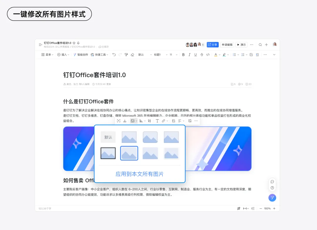
Now, with just a single click to "Replace," the document automatically detects and inherits all the original image’s style attributes—size parameters, alignment, margins, shadow effects, and more—ensuring that the newly uploaded image blends seamlessly into the document’s overall visual style.
Even when you need to change the style of all images in a document, you can simply select "Apply to All Images in This Document" in the style settings, and the changes will be applied instantly across the entire document—no more tedious, repetitive edits one image at a time.
In designing high-frequency tools, we not only aim to shorten the paths for common operations but also strive to make these tools more intelligent—anticipating your needs and ensuring that every step aligns perfectly with your expectations.
Intelligent Assistance: Reducing Repetitive Work
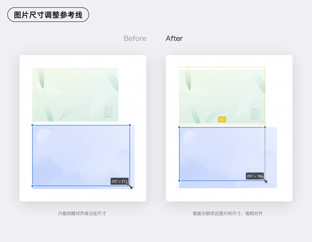
Take adjusting image size, for example. We know that when users resize images, their primary goal is usually to align the image with the surrounding layout. So we’ve brought the capabilities of professional design software directly into the document editor, adding a "Drag-and-Drop Reference Line" for images. Now you don’t have to remember exact dimensions or repeatedly drag and compare—you simply drag the image, and the system intelligently identifies the size of nearby images, snapping the new image into place with a smooth, automatic alignment.
We’ve applied a similar design approach to features like columns and tables in documents.
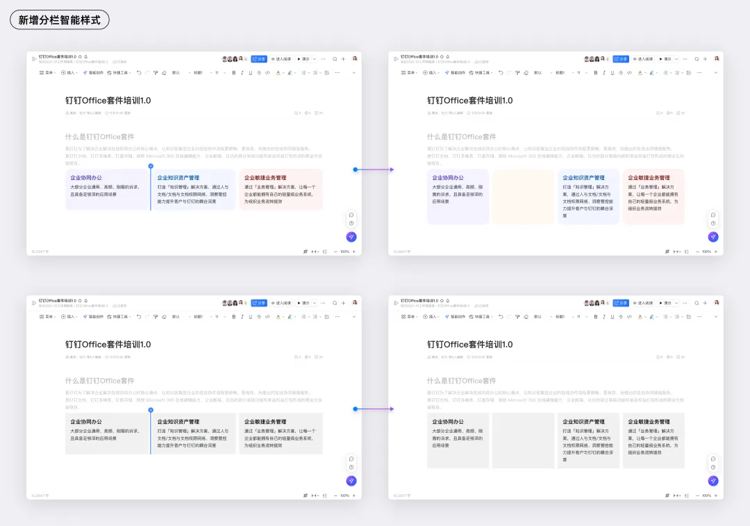
DingTalk Docs’ column feature is a powerful tool for layout design. As the functionality has grown richer, the inefficiency of style adjustments has become more apparent, and more users have complained, "It’s so annoying to adjust the style of each column individually," or "If only I could generate my preferred style with a single click based on my document’s overall theme!" To address this, we’ve given the column feature an "intelligent" upgrade.
Now, when you add a new column, the system automatically matches it with an appropriate style—color, rounded corners, spacing—based on the current content’s tone and your personal preferences. The new column looks exactly as you expect, with no additional adjustments needed.
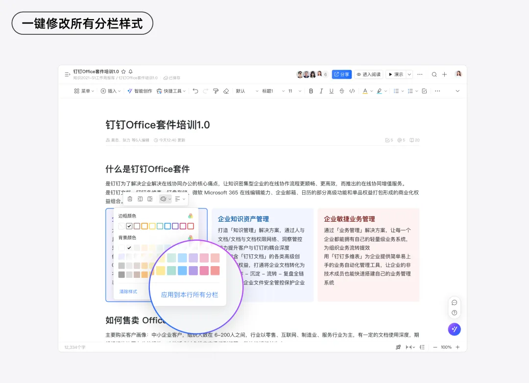
If you like the new style and want to apply it to an entire row of columns, you can do so with a single click. No more tedious, column-by-column adjustments—this dramatically boosts operational efficiency and keeps your creative rhythm flowing smoothly.
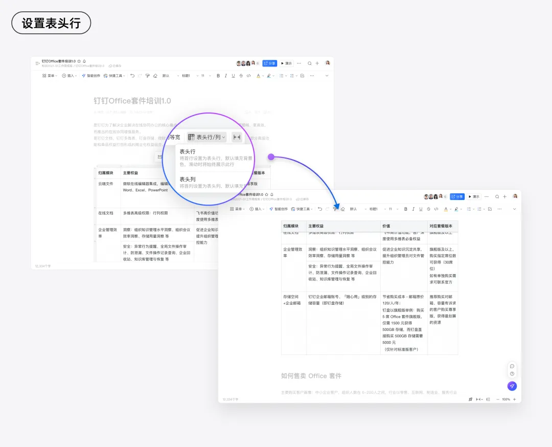
And let’s look at tables. When a table contains a lot of data, do you ever get frustrated because the header scrolls out of view, making it hard to keep track of column labels? Constantly scrolling back and forth to check the headers is inefficient. To solve this, we’ve added a "Table Header Pinning" feature. Once enabled, the table header stays fixed at the top of the page, clearly guiding you through each column’s data as you scroll. This ensures that information browsing and editing remain precise and uninterrupted, keeping you immersed in your creative work.
These seemingly small improvements can significantly reduce repetitive work, boosting operational efficiency while minimizing anxiety caused by uncertainty and missteps. With these enhancements, you can complete every creative step with greater ease and confidence.
3. Visual Expression: Lowering the Cost of Understanding
In addition to tools with complex steps, there are many "advanced" features that can be confusing and prone to misuse. To ensure that information is conveyed effectively, we’ve made these features more "visual"—like equipping them with clear navigation maps. With these visual aids, the difficulty of understanding drops dramatically, allowing both beginners and experienced users to handle tasks quickly and confidently.
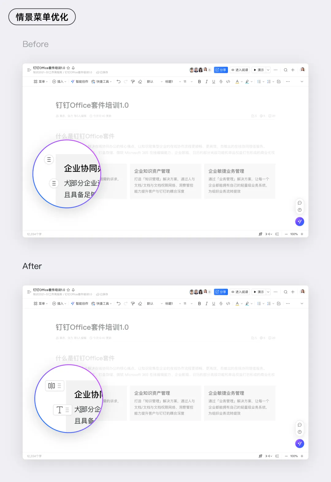
Icons Help: Clear Guidance at a Glance
Don’t you often see context menus in productivity tools that all look the same? It can be hard to tell which menu corresponds to which function. To solve this, we’ve added icons next to each menu to indicate the type of element it controls. For image-related operations, there’s an image icon; for text editing, there’s a font icon. Take a look at the optimized context menus—now it’s much easier to see which element you’re about to edit.
Dynamic Prompts: Previewing Operation Results
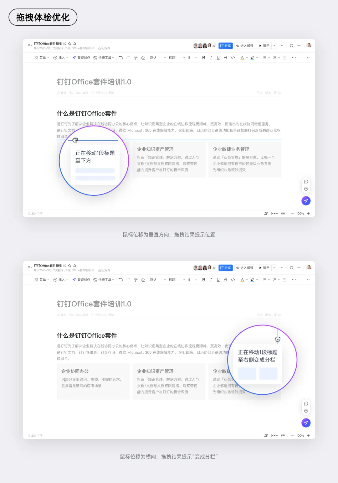
Some operations feel like opening a blind box—the outcome is completely uncertain. But if you could see the result before you take action, your creative rhythm wouldn’t be interrupted!
For example, DingTalk Docs’ drag-and-drop feature supports not only moving content up and down but also switching between columns by dragging left and right—a feature that can be hard for new users to grasp. To make it easier, we’ve designed the system to provide real-time visual feedback as you drag content, showing you exactly where the content will land and how the column layout will change after you release it. By previewing the outcome in advance, we eliminate uncertainty and anxiety, making the entire creative process smoother and more reassuring.
4. Consistency: A Smooth Experience Throughout
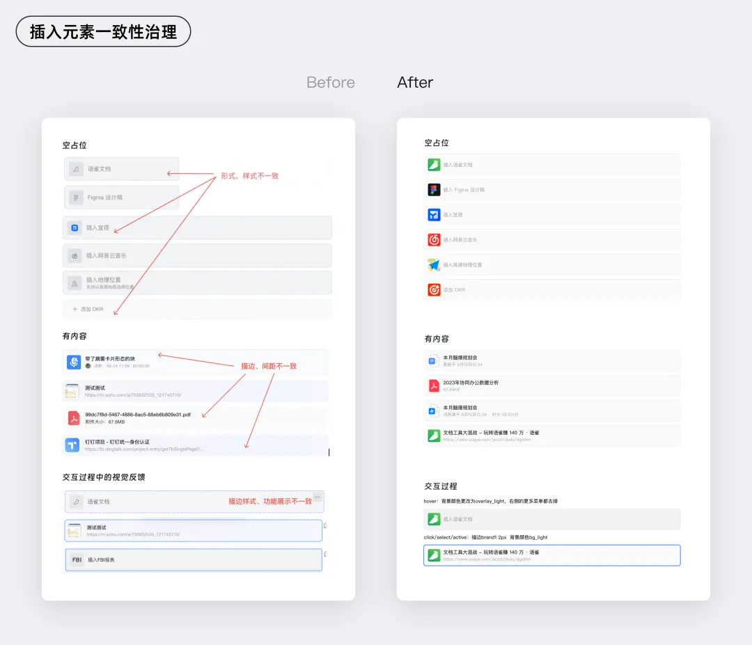
Imagine using a tool where each feature has a different visual style and interaction feedback—isn’t that frustrating? To deliver a smoother experience, consistency is just as important as the interface, workflows, and visual clarity we’ve discussed earlier. Consistency helps users develop "muscle memory," reduces cognitive load, and lays the foundation for a seamless, flow-inducing experience.
DingTalk Docs supports dozens of content modules, but due to historical reasons, the visual styles and interactive experiences of these modules have been inconsistent. For example, the way different types of inserted elements change color or display borders when selected varies widely, and there’s no unified standard for interactive behaviors. After identifying these issues, we systematically reviewed every inserted element and standardized its visual appearance and interactive feedback across different states. Take a look at the updated styles below—are they not much cleaner and more consistent?
Conclusion
In our quest to create a "flow" experience with documents, we’ve focused on interface noise reduction to make the product’s visuals cleaner; shortened paths to make the most commonly used features more efficient; enhanced visual expression to make new users feel at ease; and ensured consistency throughout the creative process. By addressing these four areas—interface noise reduction, path shortening, visual expression, and consistency—we’ve resolved over 300 user-experience issues.
Looking ahead, we will stay committed to the "flow" philosophy, continuing to innovate and refine our document-editing tools to help users effortlessly enter a flow state, enjoy the pleasure and sense of accomplishment that comes with creation, and make the creative process even more rewarding.
DomTech is DingTalk’s officially designated service provider in Macau, dedicated to providing comprehensive DingTalk services to a wide range of customers. If you’d like to learn more about DingTalk platform applications, feel free to contact our online customer service or reach us by phone at +852 95970612 or by email at cs@dingtalk-macau.com. Our skilled development and operations teams bring extensive market experience to the table, enabling us to deliver professional DingTalk solutions and services tailored to your needs!